Creating Custom Dashboards
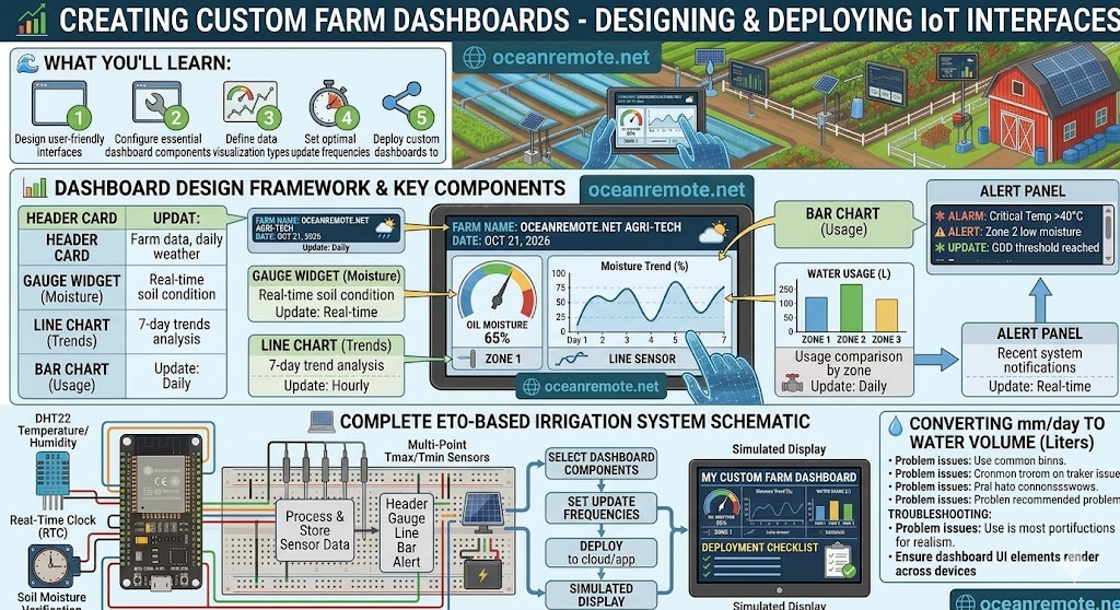
📊 Creating Custom Farm Dashboards - Visualize Your Farm Data
📊 What You'll Learn:
- 📈 Design effective farm dashboards that show critical information at a glance
- 🎯 Choose the right chart types for different data (gauges, line charts, bar charts)
- 🚨 Set up alert panels to see problems immediately
- ⏱️ Determine optimal update frequencies (real-time vs hourly vs daily)
A well-designed farm dashboard turns raw sensor data into actionable insights. The best dashboards show you what matters most at a glance - no digging through menus, no complex analysis. This lesson teaches you the essential components of an effective farm dashboard.
📋 Essential Dashboard Components
- 🏷️ Header Card: Farm name, current date, location, and summary weather (temperature, conditions). Update frequency: Daily.
- 📊 Gauge Widget: Current soil moisture percentage with color coding (Red = <30%, Yellow = 30-50%, Green = 50-75%). Update: Real-time.
- 📈 Line Chart: Moisture trend over 7 days to see patterns. Shows daily highs and lows. Update: Hourly.
- 📊 Bar Chart: Water usage comparison across zones (Tomatoes vs Peppers vs Maize). Update: Daily.
- 🚨 Alert Panel: Recent notifications - low moisture, high temp, device offline. Update: Real-time.
- 🌡️ Temperature Card: Current air and soil temperature with historical comparison.
- 💧 Humidity Card: Current humidity with disease risk indicator (High humidity = fungus risk).
- 🌧️ Rain Card: Last 24h rainfall and forecast for next 24h.
- 📍 Most important data first: Put soil moisture at the top left (where eyes naturally go)
- 🎨 Color code everything: Green = good, Yellow = warning, Red = critical
- 📱 Mobile-first design: Your dashboard should work on a phone screen
- 🔄 Auto-refresh: Dashboard should update every 10-30 seconds automatically
- 📊 One screen view: All critical info visible without scrolling
📊 Dashboard Component Details
🎯 1. Gauge Widget - Soil Moisture
Best for showing current moisture at a glance. The needle position and color tell you immediately if you need to water.
- Red zone (0-30%): CRITICAL - Water immediately
- Yellow zone (30-50%): WARNING - Plan irrigation today
- Green zone (50-75%): OPTIMAL - No action needed
- Blue zone (75-100%): WET - Risk of over-watering
📈 2. Line Chart - Moisture Trend
Shows how moisture changes over time. A downward slope means drying (normal). A sudden steep drop means possible leak.
- X-axis: Time (last 7 days by hour)
- Y-axis: Moisture percentage (0-100%)
- Threshold line: Horizontal line at 35% (watering trigger)
- Goal line: Horizontal line at 65% (optimal range)
📊 3. Bar Chart - Water Usage by Zone
Compare water consumption across different fields or crop zones.
- Bars: Each zone has its own bar
- Color: Green bars = on track, Red bars = excessive water use
- Reference line: Target water usage per zone
🚨 4. Alert Panel - Real-time Notifications
Shows the most recent alerts so you never miss a critical event.
- 🔴 Critical alerts: Moisture <25%, Temperature >40°C
- 🟡 Warning alerts: Moisture 25-35%, Temperature 35-40°C
- 🔵 Info alerts: Device online/offline, data sync status
- Clear button: Mark alerts as read
A vegetable farm created a custom dashboard with these components. Within the first week:
- 🚨 Alert panel caught low moisture at 2 AM → Farmer started irrigation → Crop saved
- 📊 Bar chart showed Zone B using 2x more water than Zone A → Found broken pipe
- 📈 Trend line revealed moisture dropping faster every afternoon → Farmer increased morning irrigation
"The dashboard paid for itself in 3 days. We caught problems we never would have seen otherwise." - Farm Manager, Nigeria
- 📱 Real-time (every 10-30 seconds): Current moisture, temperature, alerts
- ⏰ Hourly: Line charts (trends over hours)
- 📅 Daily: Bar charts (comparisons), water usage totals
- 🌤️ Every 6 hours: Weather forecast integration
- ❌ Too much information: Don't show every sensor - show only what needs action
- ❌ No color coding: Users can't quickly identify problems
- ❌ Mobile unfriendly: Farmers check phones, not computers
- ❌ No alerts: Dashboards are useless if nobody looks at them
- ❌ Stale data: Always show timestamp of last update
- ✅ Essential components: Gauges, line charts, bar charts, alert panels
- ✅ Color code everything: Green (good), Yellow (warning), Red (critical)
- ✅ Real-time for critical data (moisture, alerts); daily for comparisons
- ✅ Mobile-first design - most farmers check on phones
- ✅ Alert panel is the most important component - catches problems immediately
- ✅ One screen view - all critical info visible without scrolling
Next lesson: Exporting and Analyzing Data in Excel
- Apply these concepts directly to your farm or project.
- Take notes on important details for the quiz.
- Use the button below to track your progress.